For students: Glide through clinical cases and transform your performance with Capsule 2
The new and updated version of Capsule is here and it promises to give you an unbeatable learning experience.
We have recently given the Capsule platform a huge overhaul, refreshing the look and feel of the software whilst enhancing usability across all areas. We’ve taken feedback from student surveys to ensure the update satisfies your needs and demands.
What’s changed and why?
We’re going to take you through what’s changed and how it now benefits your overall experience. We have tweaked and refined the platform to make it even easier to use and to support your learning in the best way possible.
Case answering improvements
We collected feedback from students like you, which highlighted the need to improve how you answer cases within the platform. As a result, we’ve made the following improvements:
Quickly access the case as you answer - Students told us it would be useful to quickly reference the case description when answering the questions. We have made the cases available at the top of the screen whilst questions are answered so you can refer back to them whenever they need to.
Number of answers signposted - It’s now clear on whether it is a single answer or multiple choice question. You cannot select more than the required number of answers, which makes it less likely for you to answer mistakenly, letting you focus on learning..
Easier to list answers in the correct order - The previous drag and drop feature to answer questions was deemed a little complicated by learners. As a result, this has been changed. Simply tap the arrows next to the answers to move them up and down.
Question scoring gives you a deeper insight into your performance
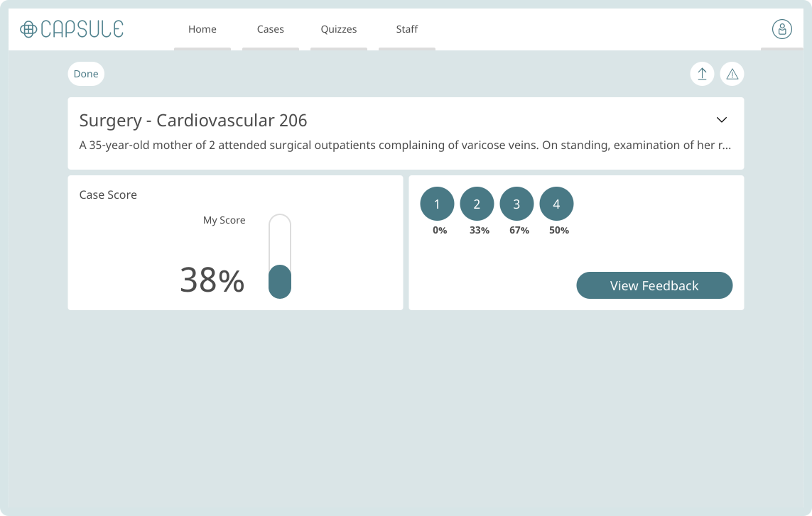
To make it easier for you to see which questions you struggled with, we have changed the scoring screen. Previously, after you had answered the questions you would be presented with an overall case score.
Now you get an overall score along with how you scored against each individual question. This makes it easier to highlight which areas of feedback you need to focus on to improve your knowledge.
Correct answers are now clearer
Rather than focusing on the answers you got wrong we’ve made it clear to see what the correct answers are, you can see those highlighted in green with a tick on the right. The answers which you selected are shown by the ticks in the boxes on the left.
‘Advanced case search’ usability improvements
With 700+ cases it’s crucial that you can find the ones you need. We have now made it simple for you to find what you are looking for by merging different filter capabilities. It is now much clearer to view which tags you’ve selected, which tags you're searching for and these will be highlighted in the results.
You can filter by specialty and or MLA tags and or case history. For example, you may want to look for ‘Medicine infection’ cases which are all tagged with ‘abdominal distention’ and you haven’t attempted the cases before.
Filter quizzes now use the advanced search capabilities
Before, it could be a little confusing for you to know what steps they needed to take to create a filter quiz. We have now installed a step by step process using the advanced search capabilities making it incredibly easy for you to follow.
Group together cases and start making quizzes which are most helpful to you.
View your case activity and progress to enhance your learning
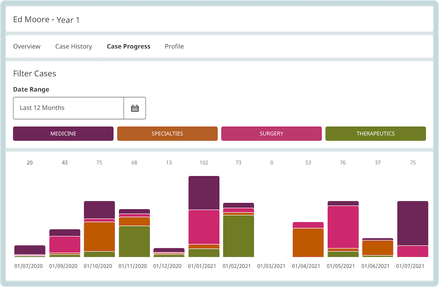
Do you study endlessly but feel like your results aren’t changing? Use our new Case Progress report to see a timeline of all the cases you have completed and by which category. You’ll be able to start viewing patterns amongst your study habits so you can tweak your behaviour to ensure you are getting the results you want.
For example, you may notice that in the month of May you studied for half the time compared to January and your focus on therapeutics was very low. As a result, you may decide to only study therapeutics for the month ahead. Whilst making a plan to ensure you complete five cases per day to keep up with your activity in January.
Share your quizzes more easily with your own student profile
Why keep all those great quizzes to yourself?
Your personal profile page now houses information about you along with all your saved quizzes. You’ll be given your personal profile URL making it easy for you to share your quizzes with your peers. Why not share your profile on socials so your friends can try out your quizzes for themselves?
This is optional, your profile is set to private by default.
The look and feel
The first thing you’ll notice is the aesthetics of Capsule. We’ve changed the fonts and colours to uplift the platform giving it a lighter, fresher, modern look and feel. See the transformation below:
Study with ease and improve your diagnostic decision-making skills
With so much clinical knowledge to learn, it’s essential that your learning tools are as easy to use as possible. We’ve revamped the platform so you can effortlessly study clinical cases, find what you need in an instance and view data to help you make informed decisions about your studying habits.
For more help on how to use Capsule visit our help centre.
Not using Capsule to rehearse your clinical decision making? Find out more about how it helps students.
If you’re not currently a user of Capsule, click the button below to explore the platform in more detail.


